20
Visualizing Ratings: Heatmaps, Distributions, and Outlier Films
Ever wonder why some movies get 1-star reviews from angry fans while others get 5-stars from critics? It’s not just about quality. It’s about how people feel, who they are, and what they expected. Raw numbers don’t tell the whole story. That’s where visualizing ratings becomes powerful.
Why Raw Averages Lie
A movie with a 7.2 rating on IMDb sounds solid. But what if 40% of voters gave it a 1, and another 40% gave it a 10? The average hides the chaos. This is called bimodal distribution - two strong groups of opposites. Movies like The Room, Star Wars: Episode I, or Avatar: The Way of Water often show this pattern. The average tells you nothing about the passion behind the votes.
Think of it like a restaurant review. If half the people say the food is terrible and half say it’s life-changing, the average might be 3.5 stars. But you wouldn’t go there based on that number alone. You’d want to know why.
Heatmaps: Seeing the Pattern Behind the Numbers
A heatmap turns ratings into color. Imagine a grid where each row is a film and each column is a rating (1 to 10). Dark red means lots of 1-star reviews. Bright yellow means a spike in 10-star ratings. Gray means silence - no one bothered to vote.
When you look at a heatmap of 500 films, patterns jump out. Some films have a solid block of orange in the middle - steady, middle-of-the-road appeal. Others show two vertical stripes: one at 1, one at 10. That’s the outlier effect. Parasite had a strong 10-star cluster from international audiences and a smaller 1-star group from viewers who expected a horror film. It’s a Wonderful Life has almost no 1s - it’s a near-universal favorite, even after 80 years.
Heatmaps don’t just show popularity. They show division. A film with a 7.8 rating but a wide spread of 1s and 10s is more controversial than a film with a 7.5 rating and a tight cluster around 7-8. The latter is quietly loved. The former is loudly loved or hated.
Distribution Curves: The Shape of Audience Feelings
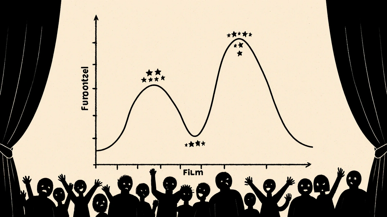
Instead of looking at individual votes, you can plot the full distribution - how many people gave each rating. This creates a curve. A normal bell curve means most people rated it around the average. A flat curve means everyone disagreed. A skewed curve means most people liked it, but a few really hated it - or vice versa.
Take Avengers: Endgame. Its distribution is heavily skewed right. Most people gave it 9 or 10. A few gave it 1 or 2 - mostly fans upset about character deaths or plot choices. Compare that to Blair Witch Project. Its curve is bimodal: a big spike at 1 (people who thought it was boring or cheap) and another at 10 (people who loved the tension and realism). The average? 7.1. But the shape tells you it’s a love-it-or-hate-it film.
Here’s a rule of thumb: if the distribution curve has two peaks higher than 15% of total votes each, it’s an outlier film. These are the movies that split audiences. They’re not bad. They’re polarizing. And that’s valuable information.
Outlier Films: What Makes Them Different
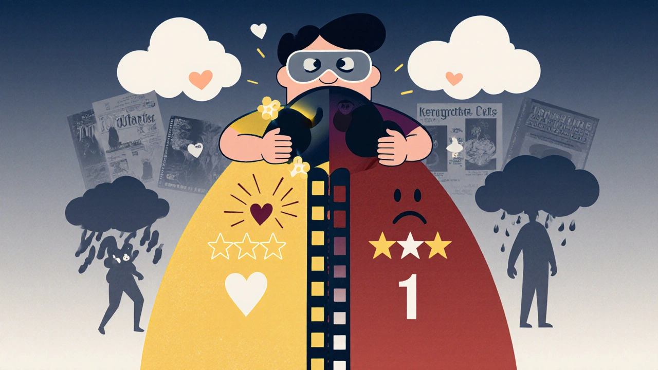
Outlier films aren’t just poorly made. They’re misunderstood, culturally specific, or deliberately challenging. Fight Club was panned by critics in 1999. Audiences loved it. Today, it’s a cult classic with a 8.8 rating and a massive spike at 10. The same film. Different context.
Some outlier films are niche by design. Annihilation got a lot of 1-star reviews from viewers expecting a monster movie. But fans of sci-fi philosophy gave it 10s. The film didn’t fail - it just didn’t appeal to everyone. That’s not a flaw. It’s a feature.
Look at Everything Everywhere All At Once. It has a 8.5 rating. But the distribution? Huge 10-star group, a smaller 1-star group, and almost no 3-6s. That’s a sign of emotional resonance. People either felt it deeply or didn’t connect at all. There was no middle ground.
These films don’t need higher averages. They need better context. A 6.9 rating on a film like Wicked (2024) might look bad - until you see the distribution: 60% gave it 10s, 30% gave it 1s. That’s not a flop. That’s a cultural lightning rod.
What This Tells You About Audience Behavior
When you visualize ratings this way, you stop seeing ratings as scores. You start seeing them as signals.
- A tight cluster around 7-8? The film is reliable. Safe. Predictable. Great for casual viewers.
- A wide spread with no clear peak? The film confused people. It might be messy, or it might be ahead of its time.
- A strong 1-star spike? Look at the reviews. Are people mad about pacing? Representation? Tone? That’s feedback you can’t get from an average.
- A strong 10-star spike? People didn’t just like it. They felt it. That’s rare.
Marketers, filmmakers, and even streaming platforms use this data. Netflix knows a film with a bimodal distribution is more likely to spark conversation - and that drives more views. A film with a 7.5 rating and a 10-star spike will trend on social media. A film with a 7.5 and a flat curve? It fades quietly.
How to Use This in Your Own Watching
You don’t need to be a data scientist to use this. Next time you’re deciding what to watch:
- Check the average - but don’t stop there.
- Look at the distribution graph. Is it a bell curve? A double spike? A flat line?
- If you see two big peaks, read the 1-star and 10-star reviews. What are they saying? Do you agree with either side?
- If the curve is tight and centered, you’re getting a safe bet. If it’s wild, you’re getting a conversation starter.
Want to avoid disappointment? Skip films with a high average but a huge 1-star spike - unless you’re the type who enjoys being challenged. Want something unforgettable? Go for the outliers. They’re the ones people still talk about years later.
Tools You Can Use
You don’t need to build this yourself. Sites like Letterboxd and IMDb Pro let you see distribution graphs. Rotten Tomatoes shows audience vs. critic splits. For deeper analysis, Python libraries like Matplotlib or Seaborn can pull data from APIs and generate heatmaps in minutes. Even Excel can plot basic distributions if you export the data.
Try this: Open IMDb for Oppenheimer. Look at the rating distribution. You’ll see a strong peak at 10, a solid group at 8, and a small but noticeable group at 1. The 1-star reviews? Mostly from people who thought it was too long or too dense. That’s not a bad movie. That’s a movie that asked a lot of its audience.
Final Thought: Ratings Are Stories
Every vote is a story. A 1-star review isn’t just a score - it’s someone who felt betrayed, misled, or ignored. A 10-star review is someone who felt seen, moved, or transformed.
Visualizing ratings doesn’t make you smarter about movies. It makes you more aware of people. The best films don’t just entertain. They spark emotion. And emotion doesn’t fit neatly into a single number. It spills over - into heatmaps, into skewed curves, into outliers that refuse to be averaged out.
Next time you see a movie with a 7.3 rating, don’t ask if it’s good. Ask: who loved it? Who hated it? And why?
What is a bimodal distribution in film ratings?
A bimodal distribution means two large groups of viewers gave very different ratings - usually a big spike of 1-star and 10-star reviews, with few ratings in between. This happens when a film is polarizing, like The Room or Parasite. It doesn’t mean the film is bad - it means it deeply resonates with some and strongly offends others.
Why do some movies have lots of 1-star reviews but high overall ratings?
Because a small group of very angry viewers can skew perceptions, but the majority still loved it. For example, Everything Everywhere All At Once has over 800,000 10-star ratings and only about 50,000 1-star ratings. The 1-star group is loud, but not numerous. The average stays high because most people gave it the top score.
How can I see the rating distribution for a movie?
On IMDb, click on the rating number and look for the bar chart showing how many people gave each score. On Letterboxd, you can see the full distribution graph under the ratings tab. Some third-party tools like Rotten Tomatoes also show audience score histograms.
Are outlier films always good?
No. Some outlier films are poorly made and just annoy people. But many are intentionally challenging - like Eraserhead or 2001: A Space Odyssey. The difference is in the reviews. If the 1-star reviews say "I didn’t get it" and the 10-star reviews say "I’ve never seen anything like this," it’s likely a bold film. If the 1-star reviews say "it’s boring" and the 10-star reviews say "it’s boring," then it’s just bad.
Do critics’ ratings follow the same patterns as audience ratings?
Not usually. Critics tend to rate more consistently - their scores cluster around 6-8. Audiences are more emotional. That’s why a film like Barbie got 8.5 from audiences but only 7.3 from critics. Critics look at craft. Audiences feel the vibe. That’s why visualizing audience ratings gives you a fuller picture.