11
Anime Aesthetics Explained: How Limited Animation, Speed Lines, and Stylization Define the Look of Japanese Animation
Ever wonder why anime looks so different from Western cartoons? It’s not just about the big eyes or the dramatic hair. The real magic lies in how Japanese animators use limited animation, speed lines, and stylization to tell stories with fewer frames, more emotion, and a visual language all their own. These aren’t just stylistic quirks-they’re deliberate choices born from budget limits, cultural influences, and a deep understanding of how movement and design can carry meaning.
What Is Limited Animation, and Why Does Anime Use It?
Limited animation means using fewer drawings per second to save time and money. While Disney’s classic films used 24 frames per second with full motion for every character, early Japanese studios like Toei Animation got by with as few as 8 to 12 frames per second. That’s half-or even less-than Hollywood. But instead of making the animation look cheap, they turned it into an art form.
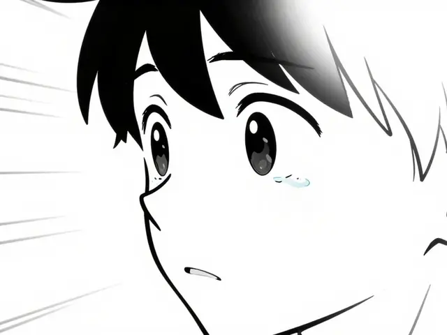
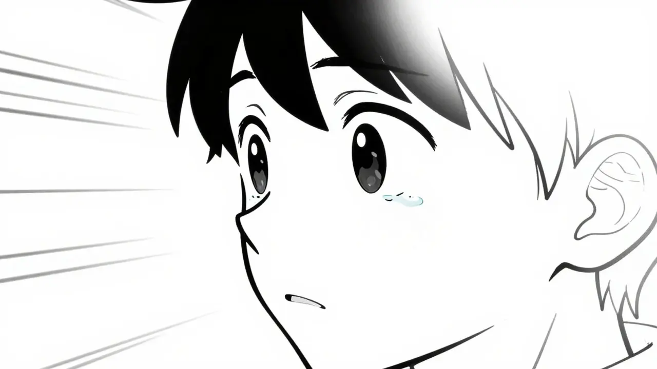
Take Astro Boy from 1963. It had only 3 to 5 drawings per second in many scenes. But the animators focused on key moments: a character’s face shifting from calm to angry, a hand gripping a weapon, a single tear falling. They let the audience fill in the gaps. This isn’t laziness-it’s trust in the viewer’s imagination. Modern anime still uses this. In Attack on Titan, entire scenes of characters running are just two or three frames repeating, but the camera shakes, the background blurs, and your brain reads it as motion.
Why stick with it? Because it works. Limited animation lets studios focus on emotional close-ups, dramatic pauses, and expressive dialogue. A single held frame of a character’s eyes widening can carry more weight than 20 frames of running.
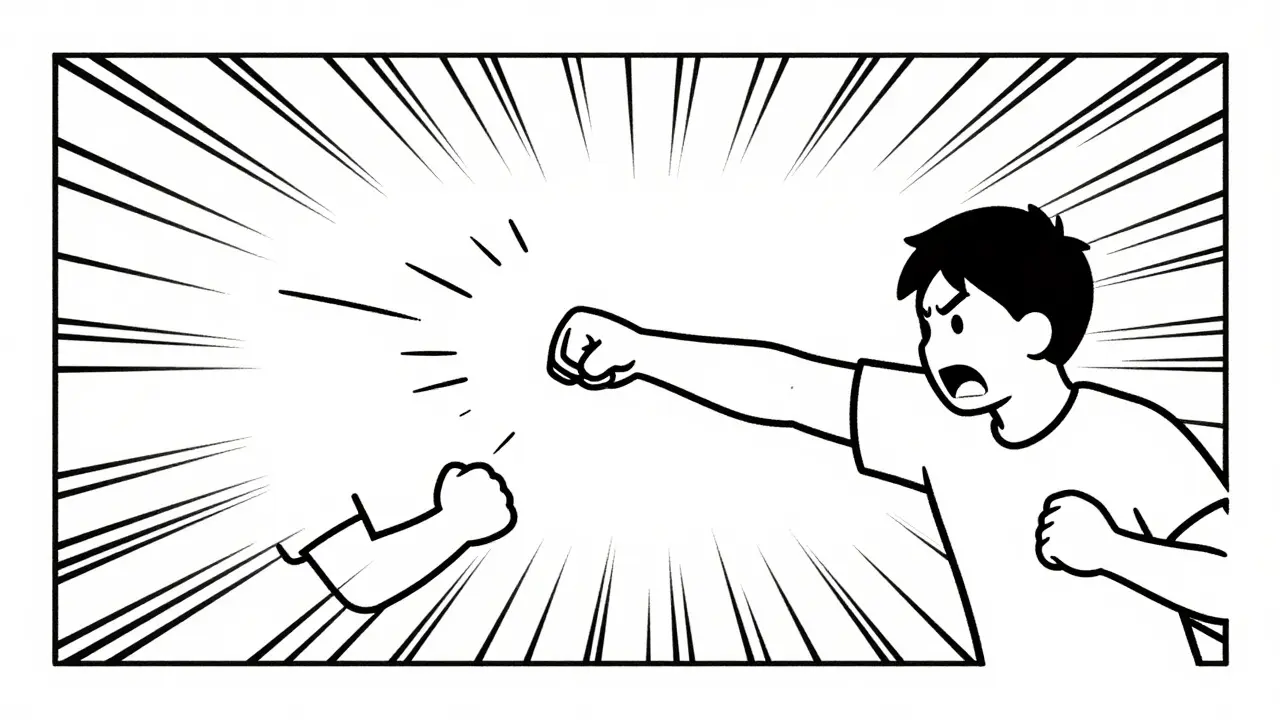
Speed Lines: The Secret Language of Motion
If you’ve ever watched a character dash across a screen and seen lines streaking behind them, you’ve seen speed lines. These aren’t just decorative-they’re a visual shorthand for motion, speed, and urgency. Unlike Western animation, which often uses motion blur or multiple afterimages, anime relies on clean, bold lines to show how fast something is moving.
Speed lines come in many forms: straight lines for linear movement, curved lines for spinning, radial lines for explosions of energy. In Dragon Ball Z, when Goku powers up, speed lines burst outward like a sunflare. In Neon Genesis Evangelion, they’re used subtly-just a few thin lines behind a robot’s arm-to suggest quiet, controlled motion.
This technique comes from manga, where artists used speed lines to imply motion on a static page. Anime inherited this and made it a core part of its visual grammar. You don’t need to see every step of a character’s movement. A few well-placed lines tell your brain everything it needs to know.
And it’s not just for action. In My Neighbor Totoro, when Satsuki and Mei run through the fields, soft curved lines ripple behind them-not to show speed, but joy. The same tool, different emotion.
Stylization: Why Anime Doesn’t Look ‘Real’
Realism isn’t the goal in anime. It’s about expression. Characters have oversized eyes, tiny noses, exaggerated proportions. Hair defies gravity. Bodies stretch and squash like rubber. This isn’t because animators can’t draw realistically-it’s because they choose not to.
Stylization in anime serves emotional and narrative purposes. Big eyes make characters more expressive. A character’s face can go from crying to smiling in a single frame because the design simplifies the features. In Perfect Blue, the protagonist’s face shifts subtly between her real self and her stage persona, using small changes in eye shape and mouth curve to show psychological unraveling. That wouldn’t work with photorealistic rendering-it needs the exaggeration of anime style.
Even backgrounds are stylized. In Princess Mononoke, the forest isn’t a detailed photograph-it’s painted with bold brushstrokes, muted greens and browns, and mist that flows like watercolor. It feels alive, not literal. Studio Ghibli doesn’t aim to recreate nature. It aims to capture its spirit.
Compare this to Western animation, where realism is often a benchmark. Pixar’s characters have detailed skin textures, realistic hair physics, and lighting that mimics real-world cameras. Anime doesn’t care. It uses flat colors, sharp shadows, and minimal gradients to create a look that’s instantly recognizable. That’s not a limitation-it’s a signature.
How These Techniques Work Together
Limited animation, speed lines, and stylization don’t exist in isolation. They feed off each other. Because anime uses fewer frames, every frame has to count. That’s why stylized designs are so important-they communicate emotion and action quickly. Speed lines add energy to moments that lack motion. Together, they create a rhythm unique to Japanese animation.
Think of a battle scene in One Punch Man. Saitama punches a villain. The punch is drawn in three frames. The background explodes with radial speed lines. The villain’s face stretches into a comical oval. No realistic physics. No slow-motion. Just pure, exaggerated impact. You laugh. You feel the force. You don’t need 24 frames to understand it.
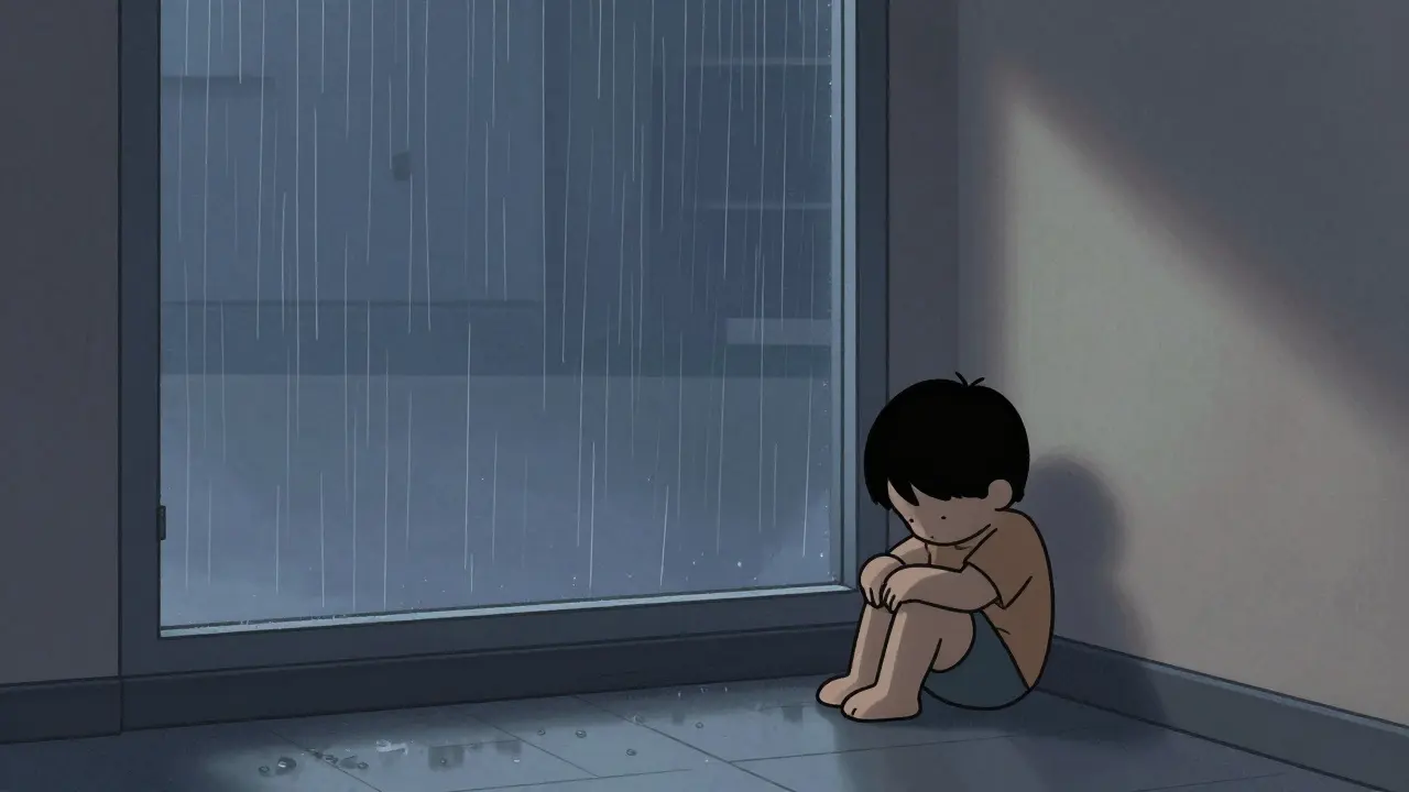
This efficiency is why anime can tackle complex themes. A 20-minute episode can explore grief, identity, or trauma because the visuals carry so much weight without needing long sequences. In Erased, a quiet moment of a boy sitting alone in a rain-soaked hallway doesn’t need music or dialogue. The rain streaks down the window, the lighting is dim, the character’s posture is slumped-and you feel the loneliness without a single word.
Why These Aesthetics Still Matter Today
Streaming platforms like Netflix and Crunchyroll have made anime global. But the core techniques haven’t changed. Why? Because they’re effective. They’re efficient. And they’re emotionally powerful.
Modern anime still uses limited animation. Even big-budget shows like Jujutsu Kaisen or Demon Slayer hold frames for emotional beats. Speed lines are everywhere-from the blur of a sword swing to the flicker of a spell casting. Stylization defines the tone: dark, gritty lines for horror, soft pastels for slice-of-life, sharp geometric shapes for cyberpunk.
And it’s influencing other media. Western animators are borrowing these tricks. Shows like Avatar: The Last Airbender and Teen Titans use speed lines and limited motion to great effect. Even live-action films like Spider-Man: Into the Spider-Verse copied anime’s bold outlines and stylized motion to create a comic-book feel.
Anime aesthetics aren’t just about looking different. They’re about saying more with less. They turn constraints into creativity. They trust the audience to feel what’s not shown. That’s why, after 60 years, they still feel fresh.
What You Can Learn From Anime’s Visual Language
Even if you’re not making anime, you can borrow its lessons. If you’re editing video, think about how you use motion. Do you overuse transitions to cover up weak pacing? Anime teaches you that silence and stillness can be powerful. If you’re designing graphics, consider how simplification can make emotion clearer. Big eyes. Bold lines. Minimal detail. That’s not lazy design-it’s focused design.
Next time you watch an anime, pause on a still frame. Look at the lines. Notice how much is left out. See how the emotion is still there. That’s the power of anime aesthetics: they don’t show you everything. They show you what matters.
Why does anime use fewer frames than Western animation?
Anime uses fewer frames because of budget and production constraints. Early Japanese studios had smaller teams and tighter deadlines. Instead of trying to match Hollywood’s frame rates, they focused on key expressive moments-like facial reactions or dramatic poses-and let the audience’s imagination fill in the gaps. This approach turned a limitation into a signature style that’s now celebrated for its emotional impact.
Are speed lines only used in action scenes?
No. While speed lines are common in fight scenes or fast movement, they’re also used to show emotional speed. A character’s realization might be shown with a single curved line behind their head, suggesting a mental leap. In romantic scenes, speed lines can ripple around two characters walking together to imply the warmth of connection. They’re not just about motion-they’re about energy and feeling.
Is anime’s stylization just for kids?
Absolutely not. While some anime targets children, the stylization is used across all age groups. Darker, more abstract styles appear in psychological thrillers like Serial Experiments Lain or horror like Paranoia Agent. Even in slice-of-life shows like Barakamon, the simplified character designs help focus attention on subtle emotions. Stylization isn’t about age-it’s about tone and intent.
Can Western animation learn from anime’s limited animation?
Yes, and many already have. Shows like Avatar: The Last Airbender and BoJack Horseman use held frames and minimal motion to emphasize dialogue and emotion. Even Pixar’s short films sometimes hold a character’s expression for several seconds to let the feeling sink in. The lesson isn’t to copy anime-it’s to realize that less movement can mean more meaning.
Why do anime characters have big eyes?
Big eyes in anime aren’t just a design trend-they’re a tool for emotional clarity. With fewer frames and simplified faces, large eyes allow animators to show subtle shifts in mood: a flicker of fear, a spark of hope, a tear forming. This style was popularized by Osamu Tezuka, who was inspired by Disney characters like Bambi. But unlike Disney’s realism, anime uses exaggerated eyes to make feelings instantly readable, even from a distance or in low-detail scenes.