13
Mastering Composition Rules: Rule of Thirds, Leading Lines, and Symmetry in Cinematography
You’ve got the perfect shot. The lighting is golden hour magic, the actor’s expression is raw and real, and your camera rig is stable. But when you scrub through the timeline, something feels... off. It’s not technical. It’s not color grading. It’s the composition. Bad framing can kill a great scene faster than bad audio ever could.
Composition isn’t just about making things look pretty. It’s how you guide the viewer’s eye. It’s how you tell them where to look, what matters, and how they should feel about it. Whether you’re shooting on an iPhone or a RED Komodo, these principles don’t change. They are the grammar of visual language. Ignore them, and your story becomes gibberish. Master them, and your images speak volumes before a single word is spoken.
The Quick Fix: Key Takeaways for Better Framing
- Rule of Thirds: Place key subjects at intersections, not center, to create dynamic tension.
- Leading Lines: Use roads, fences, or shadows to physically pull the viewer’s gaze toward the subject.
- Symmetry: Center everything perfectly to evoke order, calm, or surrealism (think Wes Anderson).
- Break the Rules: Once you know why a rule works, break it intentionally for impact, not by accident.
Why Your Brain Loves (and Hates) Certain Frames
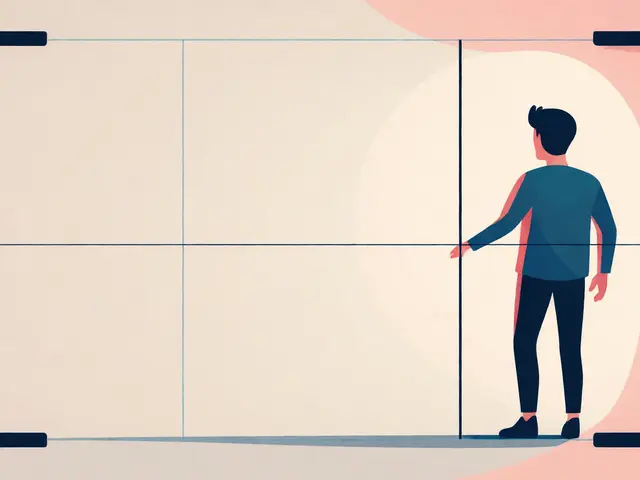
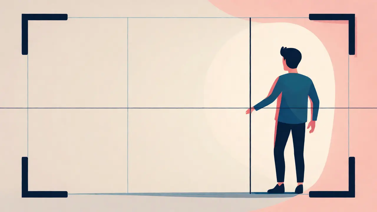
Human vision isn’t uniform. We don’t scan a screen like a computer reading code. We hunt for patterns, faces, and movement. This is biology, not art theory. When you place a subject dead-center, the brain says, "Okay, I see it." Done. No effort required. But when you offset that subject using the Rule of Thirds, a compositional guideline that divides the frame into nine equal parts using two equally spaced horizontal lines and two equally spaced vertical lines, the brain has to work slightly harder to find the focal point. That tiny bit of cognitive engagement creates interest. It makes the image feel alive rather than static.
Think about watching a thriller. If the killer appears dead-center every time, it feels predictable, almost comedic. But if they emerge from the edge of the frame, forcing you to shift your attention, the tension spikes. You’re leaning in. That’s the power of asymmetric balance. It’s not about being messy; it’s about creating a visual journey within a still image or a moving shot.
Mastering the Rule of Thirds Without Being Boring
Everyone knows the grid. Turn it on in your viewfinder, put the eyes on the top line, and call it a day. But here’s where most beginners fail: they treat the grid as a rigid cage. The Rule of Thirds is a starting point, not a law. Its purpose is to distribute weight. If your subject is on the left third, what balances the right two-thirds? Empty space? A secondary object? Negative space?
Consider a dialogue scene. You have Character A on the left third, looking right. Character B is off-screen. The empty space on the right isn’t just background; it’s "looking room" or "lead room." If you cut that space too tight, the character looks trapped. Give them room to breathe, and they seem free. Conversely, if you want them to feel claustrophobic, push them against the edge of the frame. The rule gives you the structure; the content dictates whether you follow it strictly or tweak it for emotion.
| Technique | Primary Effect | Best For | Risk if Misused |
|---|---|---|---|
| Rule of Thirds | Dynamic Balance | Narrative storytelling, interviews, landscapes | Looks generic or unbalanced if negative space is ignored |
| Leading Lines | Directional Focus | Guiding attention, depth perception, road trips | Distracting if lines lead out of frame instead of to subject |
| Symmetry | Stability & Order | Architectural shots, stylized genres, comedy | Can feel sterile or unnatural if context doesn't match |
| Center Framing | Confrontation/Isolation | Portraits, breaking the fourth wall, Wes Anderson style | Static and boring if not justified by narrative |
Leading Lines: The Invisible Hand Guiding the Viewer
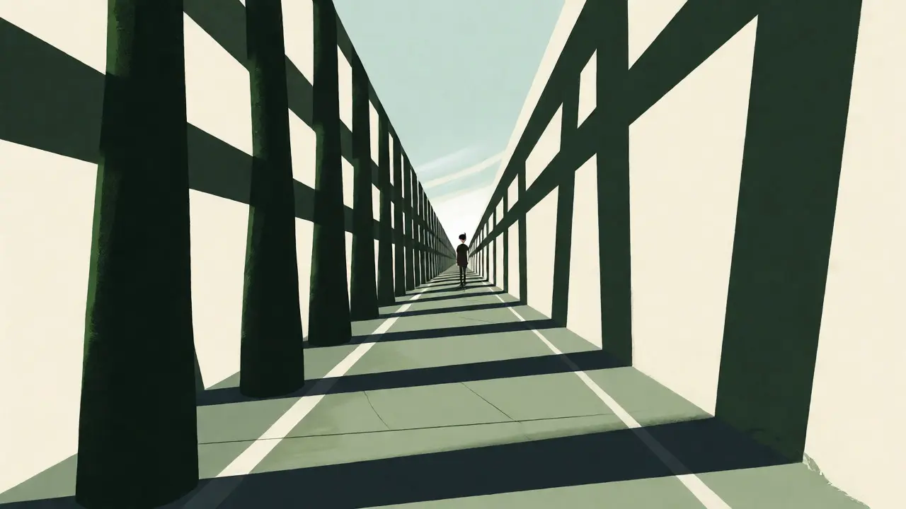
If the Rule of Thirds tells you *where* to put the subject, Leading Lines tell you *how* to get there. These are natural or man-made lines that converge or run through the frame. Roads, rivers, fences, hallways, even shadows cast by window blinds. They act as arrows. Our eyes naturally follow lines. If you have a strong diagonal line cutting across the bottom left of your frame, the viewer’s eye will travel up that line until it hits a stop. Make sure that stop is your subject.
A common mistake in urban cinematography is letting the lines lead the eye out of the frame. Imagine a shot down a long corridor. The walls form converging lines. If the subject is standing halfway down, great. The lines pull us to them. But if the subject is small and far away, and the lines continue past them to the vanishing point, the eye skips over the subject and exits the frame. You lose the focus. To fix this, use foreground elements to interrupt the line early, or ensure the subject sits exactly where the lines converge.
Curved lines work differently. While straight lines suggest speed, direction, and urgency, curves imply grace, flow, and organic movement. A winding path in a forest shot suggests a journey with twists and turns. A straight highway suggests a destination. Choose your geometry based on the emotional tone of the scene.
Symmetry and Center Framing: When Balance Means Power
We spent years learning to avoid the center. Now, look at films like The Grand Budapest Hotel or Parasite. Perfect symmetry is everywhere. Why? Because symmetry feels deliberate. It feels constructed. In reality, nothing is perfectly symmetrical. So when you force it in a frame, it signals artificiality, control, or extreme order.
Symmetry in cinematography often represents stability or stagnation. A character stuck in a routine might be framed symmetrically, surrounded by identical objects on either side. It shows they are trapped in their own pattern. Break that symmetry-have one chair knocked over, or one light flickering-and suddenly, chaos enters the ordered world. The disruption becomes the story.
Center framing is also powerful for confrontation. Think of a standoff in a Western. Both characters face each other, centered. It forces the viewer to engage directly with both parties equally. There’s no hierarchy of left or right. It’s a duel. Use center framing when you want the audience to stop scanning and start staring.
Framing Within the Frame: Adding Depth and Context
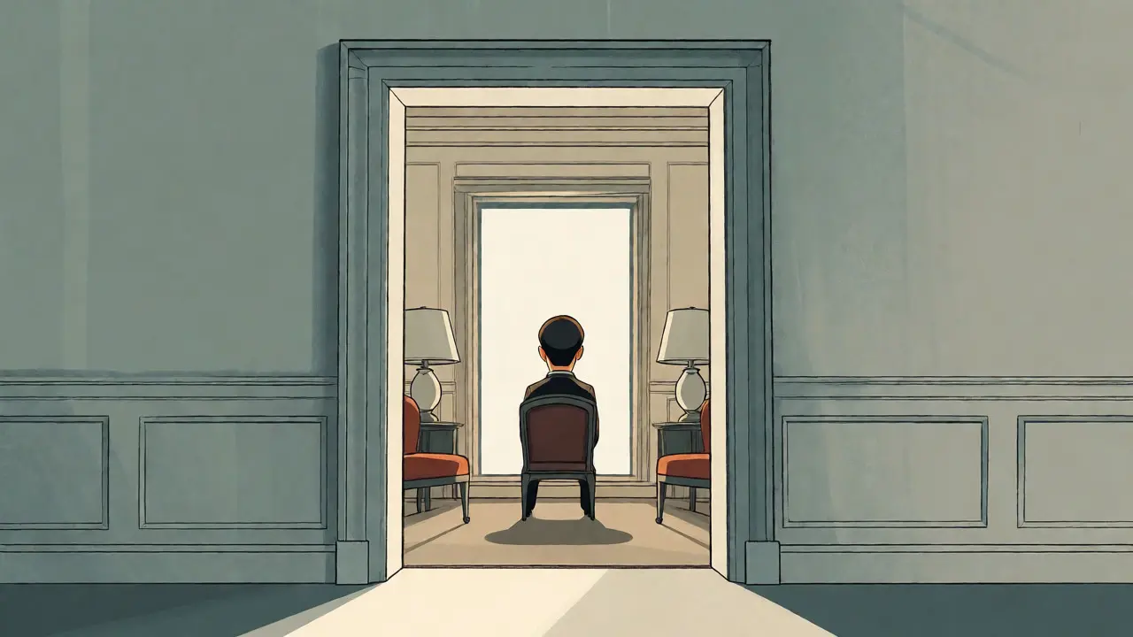
You don’t just compose the subject; you compose the environment around them. This is called "framing within the frame." Use doorways, windows, arches, or branches to create a border around your main subject. This adds layers. It separates the foreground from the midground, giving the image three-dimensional depth on a two-dimensional screen.
This technique also acts as a filter. Looking through a dirty window tells us the character is an outsider looking in. Peeking through a crack in a door implies voyeurism or secrecy. The frame itself becomes part of the narrative. Don’t just shoot through a doorway because it looks cool. Ask yourself: What does this barrier say about the relationship between the viewer and the subject?
Practical Tips for On-Set Composition
- Check the Edges: Before rolling, scan the perimeter of your frame. Is there a distracting trash can? A half-visible sign? Move the camera or the subject to clean up the edges. Clutter kills composition.
- Mind the Headroom: Too much space above the head makes the subject look small and insignificant. Too little makes them look cramped. Aim for just enough space to let them "breathe," usually aligning the eyes with the top third line.
- Use Lens Choice Wisely: Wide-angle lenses exaggerate perspective and leading lines. Telephoto lenses compress space, flattening backgrounds and isolating subjects. Your lens choice changes how your composition rules apply.
- Move Your Feet: Don’t just zoom. Physically move the camera. Changing your angle changes the relationship between foreground and background elements, which is crucial for depth.
Breaking the Rules Intentionally
Once you understand why these rules exist, you can break them. But there’s a difference between breaking a rule intentionally and ignoring it out of ignorance. If you center a subject in a chaotic scene, it highlights their isolation amidst the noise. If you ignore the horizon line and tilt the camera (Dutch angle), you signal psychological unease.
The goal isn’t to memorize formulas. It’s to develop an instinct for visual balance. Watch movies. Pause on frames that grab you. Ask: Why did they put the person there? Where do my eyes go first? Then try to replicate that feeling with your own gear. Practice makes perfect, but analysis makes progress.
Is the Rule of Thirds outdated?
No, but it is often misapplied. It remains a fundamental tool for creating dynamic balance and guiding the viewer's eye. However, modern cinematography frequently uses center framing or asymmetrical imbalance for specific stylistic effects, so while the rule is valid, it is no longer the only way to compose a shot.
How do leading lines work in video versus photography?
In photography, leading lines are static; the viewer explores them at their own pace. In video, camera movement interacts with leading lines. Moving the camera along a leading line can enhance the sense of journey or speed, while keeping the camera static allows the subject's movement to activate the lines. Timing and motion become critical factors.
When should I use symmetry in my videos?
Use symmetry when you want to convey order, perfection, sterility, or surrealism. It works well for architectural shots, stylized comedies, or scenes depicting rigid social structures. Avoid it for gritty realism or chaotic action unless you are deliberately contrasting the character's internal state with the external environment.
Does lens choice affect composition rules?
Absolutely. Wide-angle lenses stretch perspective, making leading lines more dramatic and emphasizing depth. Telephoto lenses compress the background, reducing the apparent distance between layers and potentially flattening the effect of leading lines. Always adjust your composition strategy based on the focal length you are using.
What is 'negative space' and why does it matter?
Negative space is the area around and between the subject(s) of an image. It matters because it provides visual breathing room and helps define the subject. Large amounts of negative space can isolate a subject, emphasize loneliness, or direct attention sharply to the main element without distraction.