App Navigation: How Design Shapes Your Video Streaming Experience
When you open a streaming app, app navigation, the system of menus, buttons, and pathways that guide you through content. Also known as user interface design, it's the invisible hand that decides whether you watch something great or just scroll forever. Bad navigation makes you feel lost. Good navigation makes you feel understood. It’s not about flashy animations—it’s about reducing friction so you spend less time hunting and more time watching.
App navigation doesn’t exist in a vacuum. It’s shaped by streaming app interface, the layout and controls users interact with on phones, tablets, and TVs. Netflix’s horizontal scroll, YouTube’s vertical feed, Disney+’s genre-first layout—they all reflect different priorities. Some apps push new releases front and center. Others bury them under layers of recommendations. And then there’s user interface design, the craft of building intuitive systems that match how people actually think and move. A good UI doesn’t just look clean—it anticipates your next move. Think of how a kids profile on Netflix hides adult content automatically, or how data saver mode quietly adjusts quality without asking. These aren’t features—they’re silent promises that the app gets you.
People don’t care about the tech behind it. They care if they can find their show before they forget why they opened the app. That’s why mobile video apps, streaming apps optimized for phones and tablets with touch-based controls. need simpler, bigger taps and fewer steps. A parent juggling a crying baby doesn’t want to dig through five menus to find a cartoon. A student on a slow connection doesn’t want to wait for a 4K trailer to load before skipping ahead. The best app navigation adapts to real life—not the other way around.
What you’ll find below are real examples of how app navigation affects what you watch, how much you pay, and whether you stick with a service or cancel. From how Netflix uses your watch history to guide your next click, to why some apps hide the downgrade option in plain sight, these posts cut through the noise. You’ll learn how to spot bad design before it wastes your time, and how to use smart navigation to get more value from every subscription. No fluff. Just what works—and what doesn’t.

16
Organizing Your Streaming Apps: Best Practices for Easy Navigation
Organize your streaming apps to save time and reduce frustration. Learn how to clean up your home screen, group apps by use, create folders, rename profiles, and use voice commands for effortless viewing.
Latest Posts


Popular Posts
-
 Adventure Pulp on Screen: Analyzing The Mummy, The Rocketeer, and Serial DNA
-
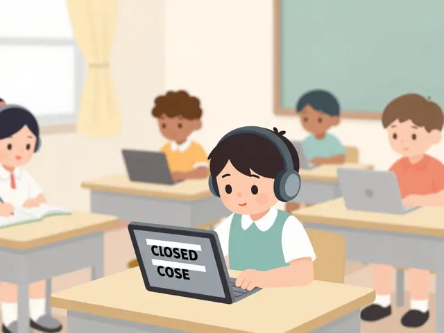 Accessibility for Kids: How Captions and Audio Descriptions Help Learning
-
 YouTube TV vs. Hulu + Live TV: Comprehensive Family Streaming Comparison
-
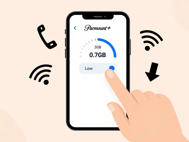
 Paramount+ 4K Devices: Best TVs and Streamers for Ultra HD
-
 How to Secure Your Netflix Account: 2FA and Login Alerts Guide